Get set up with Menthor Q in less than 5 minutes

In this article we will show you how to get set up with Menthor Q Data in a few minutes.
We provide cutting edge analysis of the option market by looking at complex data and simplifying it for your trading. We look at momentum, sentiment and market positioning through the option data. We then provide simple tools to help you decode this data and be ready to make actionable trades!
How to get set up with Menthor Q
In this video we will put everything into practice and show you how you can leverage the Menthor Q Data in our daily routine.
The first step is to sign up for our free report or our premium membership.
Via the Free Report or the Premium Membership you will get access to the Menthor Q Data. You can find additional documentation on our models in our Resource Portal.
The goal of the models is to predict key price levels, anticipate market volatility, and identify market momentum, giving you the edge you need to make profitable trades.
Here we share some insights on how to use the data to get set up for your trading in a few steps.
Step 1. TradingView Levels
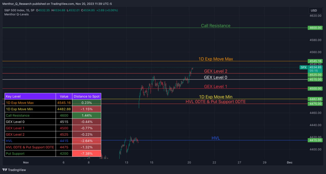
The first thing we want to do in the morning is to place the levels into TradingView. To set up the Menthor Q Levels Indicator follow our TradingView Tutorial.
You can download the levels on Stocks and ETFs from the Premium Membership via the Bot or download the levels on SPX, QQQ and VIX via the Free Report.
The reason we want to do this is to be able to see how far the spot is from the key levels. The table on the bottom left is particularly helpful, because there you can see the distance between the spot and all of the major levels.
Step 2. Liquidity Regime
Once we have placed the levels and have the chart at hand, the next thing we really want to do is understand what gamma regime we are in: Positive or Negative.
In the bot you can download the Liquidity Snapshot by following this command in the Query Bot: /liq_snapshot.
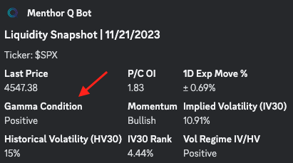
Here I can find key information in one place:
- Gamma Condition. In our model, we analyze the complete options chain to compute both the overall gamma exposure and gamma condition. Knowing if we are in Positive or Negative Gamma can help us define the strategy for the asset we are monitoring as it dictates the expected volatility levels throughout the day.
- Historical, Implied Volatility and IV Rank. We can quickly understand the Volatility of our asset and use this information for our strategies. To be successful in trading you need to be on the right side of volatility. If you want to learn how to better understand Volatility and Options Greeks we have created our Academy.
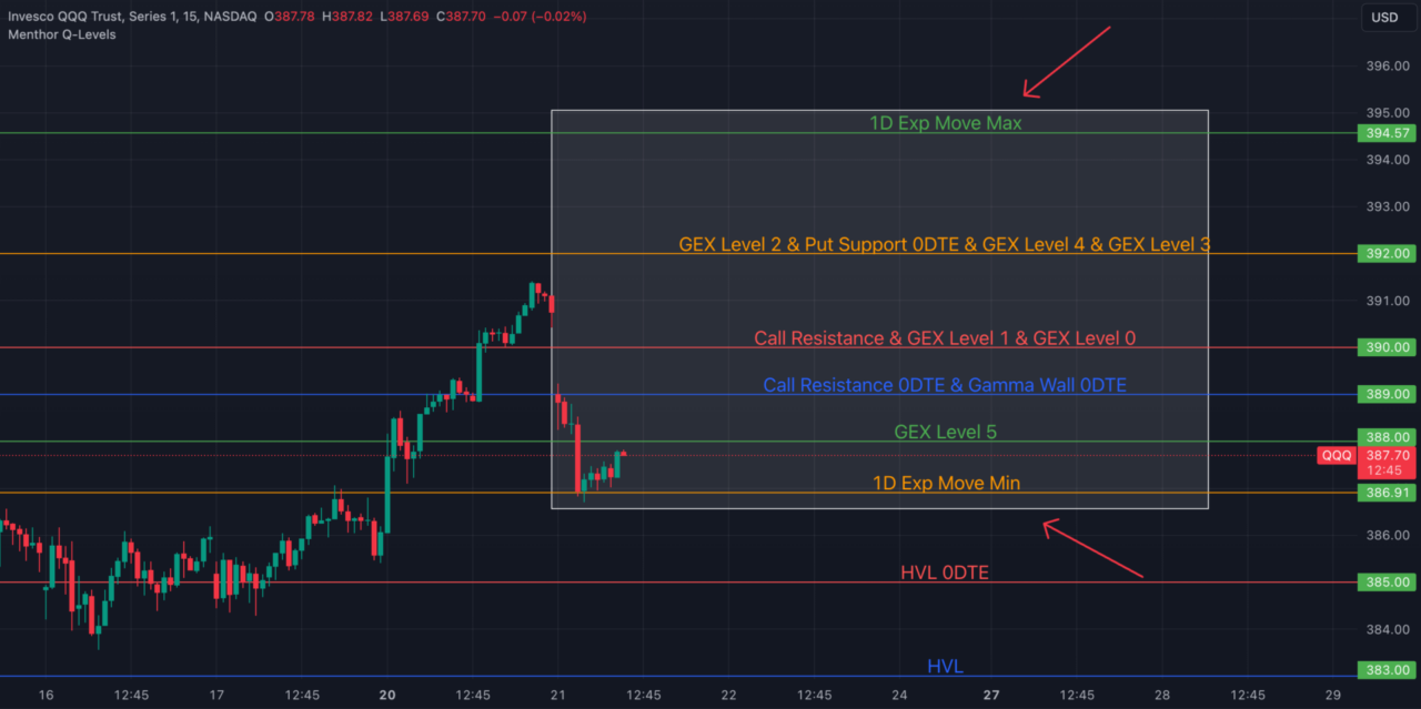
- 1 Day Expected Move percentage. This is our 1 Day Expected Move indicator. By looking at forward looking volatility the indicator forecasts the potential move for the day. As you can see it provides a maximum and a minimum price range to give you an indication of the price volatility.
Knowing if the day is volatile or not can give you more insight together with the level in the first chart. When we are in negative gamma, we know that the market intraday will be moving more, so those levels that you see in the chart have more chances of getting hit.
At this point, we move on and look at the 1D Expected Move. Again that can be downloaded from the Query Bot by inputting the command: /key_levels or /mainchart. Here we get further info, and by looking at volatility, the models gives us an expected range.
The expected range can be used to set the strikes for your spreads. At this point, of our review this is what we have:
- All of the key levels and the distance from spot
- Liquidity snapshot can help us understand how potentially volatile the day will be
- 1D Move narrows down those possibility by looking at volatility
Step 3. Key Levels Table
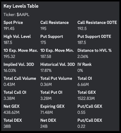
The next thing we want to do is really dig deeper into what strikes or key levels have the potential to be sticky. Those strikes become more “sticky” when we are in negative gamma. That is because in negative gamma, the spot price moves more rapidly in both directions. In that case the strikes with more gamma tend to be hit more.
We want to look at the Key Levels Table. First we look at the primary levels, in particular the Call Resistance, the High Vol Level and the Put Support.
We want to see where they are, compared to the spot price. Based on volatility we will have an insight of potential price outcomes. We also want to compare if these levels have shifted higher or lower compared to the previous days. In the Key Levels Table you will also find many other fields like open interest, put call ratios, volumes and more. All the data you need in one place.
That is why, knowing what those sticky strikes are, can help you know better where you should place your strikes for your option spreads. So how do we find those sticky strikes?
Step 4. Net GEX
First we look at the Net GEX chart. The Net GEX is the net gamma exposure for a ticker. It is an important metric for evaluating the level of realized volatility in the market.
A positive Net GEX is indicative of lower volatility. This is because if the market maker is long Net GEX, they are able to decrease realized volatility by delta hedging. The market maker would go short when the market surges and go long when it declines, thereby reducing volatility.
However, if the Net GEX is negative, the opposite effect is observed. In such cases, the market maker shorts the market when it drops and goes long when it surges, which amplifies the market movements.
In this chart we analyze the full Option Chain and look at key levels with higher levels of positive and negative Net GEX. These levels are catalysts for market activity around these key price levels.
You can access Net GEX on Stocks, Indices and ETFs via the Premium Membership.
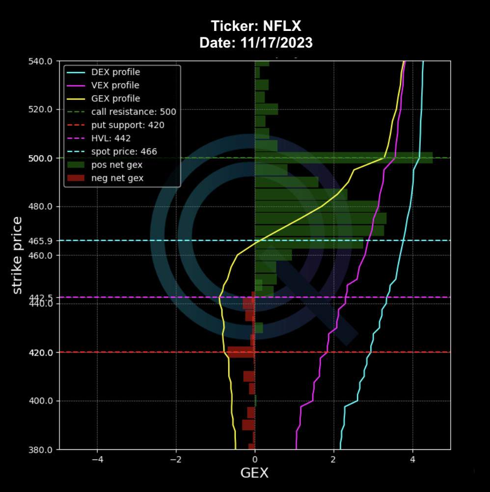
Primary levels like the Call Resistance will have the highest Net GEX. We then have secondary levels as displayed in the chart. We watch these secondary levels to spot an increase in GEX. Secondary levels can become primary levels as we move in time and investors positioning changes.
Step 5. Volumes and Open Interest
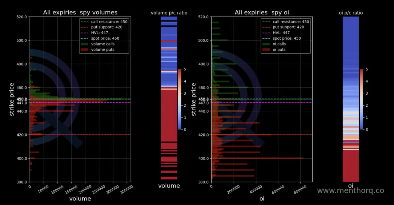
Then we want to see confirmation from Volumes and Open Interest. Large open interest help build that gamma positioning. You can find this in the Query Bot Command: /voloi.
We want to understand if open interest is higher on the call or put side. This can give us interesting indications on sentiment and market positioning. We confirm that with volumes. Spikes in volumes and open interest can be important sentiment indicators. If that happens we want to then compare those strikes with their gamma exposure.
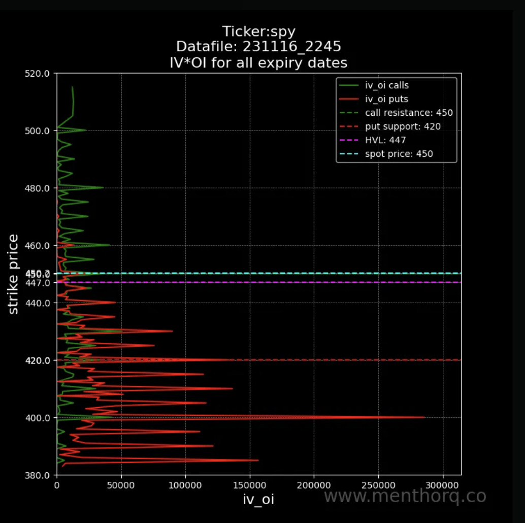
We then look at the IV * OI Model. This is particularly helpful, when it is high, it means that those particular strikes are getting hit bringing volatility higher. You can see this by calls or puts. You can find this under the Query Bot Command: /ivoi.
These are just some of the functionalities that can allow you to improve your trading and risk management. Next week we will cover other ones and will start talking more about strategies too.
Step 6: Option Matrix
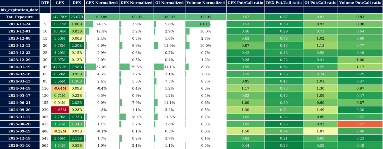
The Option Matrix is a very important tool, most of our data is displayed here by expiration date. This is helpful because every morning we can see GEX or Gamma Exposure, DEX or Delta Exposure and relevant ratios from 0DTE all the way to monthly expirations.
This helps understand volatility and how investors are positioning themselves throughout the option chain in the future.
Step 7: Term Structure
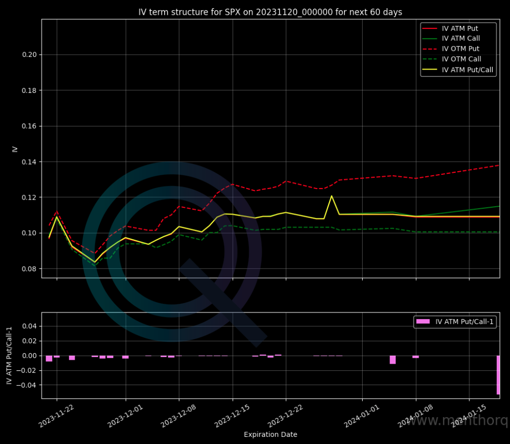
The Term Structure helps us visualize implied volatility by maturity. Spikes along the term structure can help us understand if certain maturities are getting bid harder than others.
The good thing about this chart is that you can see the at the money volatility for puts and calls. Spikes in At the Money calls would mean that calls are getting bid harder than puts. You can access this data via the /term command in our Premium Membership.
Step 8: Macro and Systematic Models
The last step is to watch the macro environment and the positioning of the systematic and quant funds. Systematic funds do not drive the market but can accentuate liquidity moves once specific price levels are triggered. Knowing if they are long or short can give you a better understanding of the overall liquidity in the market. You can find our volatility and liquidity models within the Premium Membership.
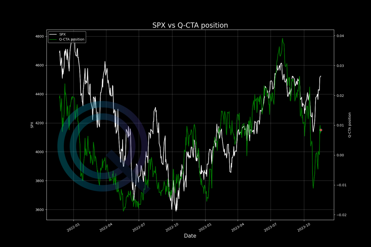
First our CTAs Model.
CTAs are a type of investment fund that primarily focuses on trading in futures and options contracts across a range of asset classes. They use systematic and rule-based trading strategies, often relying on computer algorithms to make trading decisions.
These strategies are designed to exploit market trends, momentum, and other quantitative factors.
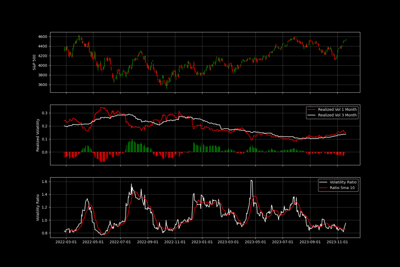
Then our Volatility Control Fund Model. Volatility Control is a type of investment strategy designed to actively manage and control the level of volatility in a portfolio. These funds aim to provide a more stable and predictable investment experience by adjusting the allocation of assets based on market volatility.
Now that we have our routine set up and all the models in one place we are ready for our trading day.
You can find all these data and models within our Premium Membership.
