Menthor Q CTAs Funds Model

CTAs funds, short for “Commodity Trade Advisor” funds, represent a significant component of the financial landscape. These funds employ systematic trading strategies, primarily relying on technical & momentum analysis and price level triggers to implement trend-following strategies on the most liquid assets in the market.
Using futures contracts and their associated leverage, CTAs have an impact on market liquidity, in particular when it’s needed to support a trend, hence accentuating market moves.
In this article we will show the importance of CTAs and the Menthor Q CTAs Model.
Why are CTAs important for the Market?
CTAs are lagging indicators, because they enter trends once they have already initiated. However, they have a pivotal role in maintaining market liquidity, and their importance cannot be understated.
Commodity Trading Advisors (CTAs) and CTA funds can have several impacts on the financial markets:
- Liquidity Provision: CTAs are active participants in various financial and commodity markets. They contribute to market liquidity by actively trading and providing bid and ask quotes. Their presence can help reduce bid-ask spreads and make it easier for other market participants to buy or sell assets.
- Price Movements: Depending on their trading strategies, CTAs can influence price movements in the markets they operate in. For instance, trend-following CTAs may amplify price trends by following the direction of the market, while contrarian CTAs may influence reversals by betting against prevailing trends.
- Market Volatility: Some CTA strategies thrive in volatile market conditions. When markets experience significant volatility, CTAs may increase their trading activity, potentially contributing to higher volatility.
- Risk Management: CTAs are often skilled in risk management. When market conditions become extreme or overly speculative, CTAs may reduce their exposure to manage risk. This can help stabilize markets during turbulent times.
- Diversification: CTAs often invest across various asset classes, including commodities, currencies, fixed income, and equities. This can attract capital to less traditional markets and help diversify investment portfolios.
- Correlation: The trading activities of CTAs can affect the correlation between different asset classes. For example, their trading can lead to increased correlation between various commodity markets, impacting how they move in relation to each other.
- Systemic Risks: If a significant number of CTAs employ similar strategies or have a high level of exposure to specific markets, it can create systemic risks. A sudden rush to exit similar positions by multiple CTAs can lead to market disruptions.
The Performance of CTAs Funds
On average, CTA funds generate average yearly returns of 6.9% while the S&P 500 Index, has an average yearly return of approximately 9%. Nonetheless, when assessing risk-adjusted returns, CTAs exhibit lower drawdowns compared to the S&P 500 Index.
This strategy’s advantages include diversification, typically showing little correlation with other asset classes, and an inverse correlation with stocks and bonds.
The Menthor Q CTAs Funds Model
The Menthor Q-CTA Model offers a tool for tracking CTA positions and monitoring changes in their exposure. This analytical approach comprises tables and charts designed to understand the CTA positioning.
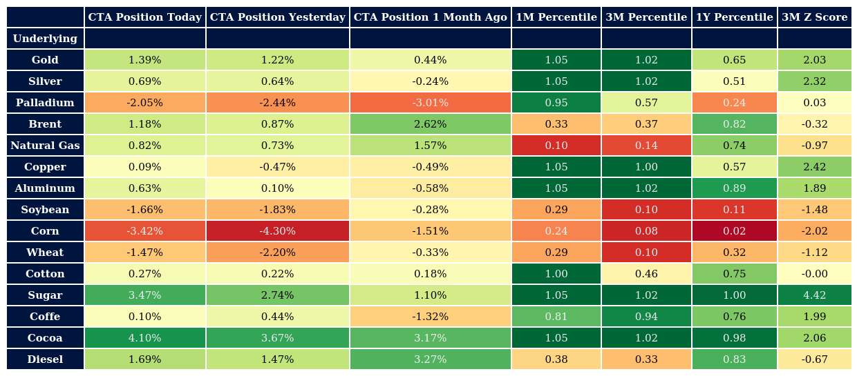
CTAs Model Tables
The Menthor Q CTA Model is organized into four tables:
1.Main Table: This table provides a broad overview of CTA positions across various asset classes.

2.Index Table: Delving deeper into equities, this table reveals how CTAs allocate resources among major stock indexes.

3.Currencies Table: Focused on liquid currencies, this table aids in understanding liquidity trends in different countries.

4.Commodities Table: As a primary asset class for CTAs, this table serves as a confirmation tool for detecting new trends in commodities trading.

Table Features
Each table comprises columns with distinct information:
- Underlying Asset: Identifies the asset to which the row pertains.
- CTA Position Today: Represents our estimates of CTA positions in that asset as a percentage of the total risk CTAs can allocate in the market.
- CTA Position Yesterday and CTA Position 1 Month ago: To dig deeper, it is useful to conduct a comparative analysis by comparing the current position with that of the previous day and one month prior.

- Percentile Columns: The percentile columns within our analysis framework serve as tools for contextualizing today’s positions within historical perspectives. These percentiles offer a percentage-based comparison in which values span from 0 to 1, with 0 indicating that the current value is at its historical low within the considered period, and 1 signifying that the current value stands as the historical peak. This percentile data serves multiple functions in our analysis:
- Assessing Position Trends: We employ these percentile columns to gauge whether CTAs are amplifying or diminishing their positions.
- Trend reversal: For instance, when observing a remarkably low 1-year percentile, such as below 0.15 or 0.2, alongside a high 1-month percentile, denoted by a value of 1, it suggests that CTAs may have reduced their positions over the course of the year, only to reverse this trend recently. However, such conclusions are fortified when corroborated by data from chart representations. This reasoning obviously also applies in reverse when there is a high 1-year percentile and a low 1-month percentile.
- Extreme Readings: In certain instances, extreme readings across all three percentiles, with all values equating to either 0 or 1, can serve as potent indicators of a risk zone where there might be potential turning points in position trends. Yet, we exercise prudence and seek further confirmation from the z-score and graphical data to validate whether current readings mirror past precedents.
In summary, the percentile analysis gives us an overview of how current positions align with historical data, signaling in the identification of noteworthy trends and potential market inflection points.
- 3-Month Z-Score: This metric plays a pivotal role in quantifying the deviation of the current value from the three-month average in terms of standard deviations. Values exceeding 2 or falling below -2 are categorized as extreme.
The interpretation of extreme Z-Score values can unveil two opposite scenarios:
- Rapid Reversion of Position Trends: Elevated Z-Score values suggest that CTAs are swiftly reverting the prevailing position trend. This dynamic signifies a notable shift in market sentiment and positioning.
- Significant Departure from Average Positioning: When Z-Score values are significantly distant from the average positioning, it implies that temporary mean-reverting behavior in the asset’s exposure could materialize. It’s important to note that this doesn’t necessarily indicate a full reversal of the trend but serves as an indicator of a risk zone where the likelihood of a trend acceleration is diminished.
To understand which scenario we find ourselves in, it is necessary to integrate the analysis with the observation of the percentiles and the charts.
CTAs Model Charts
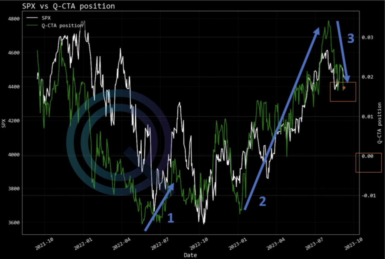
Charts play an important role in confirming findings from the tables. They compare Q-CTA positioning (on the right axis) with the underlying asset prices (on the left axis), allowing for a quick assessment of current and past positions and their trend.
In the chart, you can access the historical price data of the chosen asset along with the time series of the Q-CTA positions. These positions represent daily values that are provided each day in the tables. These visual representations offer a rapid comprehension of recent positioning and denote the latest position with a red dot.
On the right axis, the size of the position is presented as a percentage of the total allocable risk within the CTAs portfolio. For instance, in the graph below, a value of 0.01 signifies that the estimated CTAs exposure to SPX stands at 1% of their overall market risk allocation. Values surpassing 0 indicate long positions, while those falling below 0 signify short positions.
Furthermore, these illustrations can unveil underlying trends in the positioning. For example, an ascending green line implies an increasingly bullish sentiment among CTAs, whereas a descending trend signals the opposite, indicating a more bearish stance in their positioning.
We provide CTAs Charts for Major Assets: SPX, Nasdaq, Brent Oil, Crude Oil, Copper, Silver, Gold, Natural Gas, Treasury.
For example, a red dot denotes the current CTA position, with values above 0 indicating long positions and values below 0 indicating short positions.

Consider the instances delineated by the blue arrows, which encompass three distinct scenarios:
- CTAs in Diminishing Short Positions: In the first scenario, CTAs maintain short positions, denoted by values below 0, but are actively reducing their exposure. This shift suggests a reevaluation of their market positioning.
- Transition from Short to Max Long Positions: The second scenario represents a transformation in CTA positions, transitioning from short positions to maximum long positions. This notable shift signifies a substantial change in market sentiment.
- CTAs Reducing Long Positions: In the third scenario, CTAs persist in long positions, indicated by values above 0, while concurrently diminishing their exposure. This dynamic implies a recalibration of their risk profile.
Analyzing these position trends provides valuable insights into the future positioning of CTAs, offering indications of whether they are inclined to augment or reduce liquidity in the forthcoming period.
In conclusion, the Q-CTA model offers a comprehensive framework for analyzing CTA funds, their positions, and their potential impact on market dynamics. By harnessing the data presented in these tables and charts, investors and analysts can gain valuable insights into CTA strategies and their implications for the broader financial landscape.
Case Study: Crude Oil (CL)
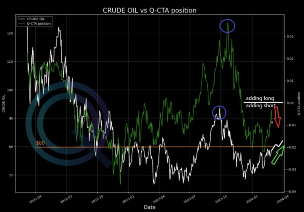
In the example below, we are using the CTA chart for Crude Oil.
What things you can look at?
These are some of the points you could keep into consideration:
- How is the positioning and how is the pricing of the asset?
- Do the CTAs have a trend and match up with the price? Sometimes they are in line, sometimes not (whole of 2023)
- If you have a range market like CL and they are adding shorts, as they did for a week now, but your asset goes up, they will get squeezed
- You can spot the highs in prices, and the highs in CTA as well as the lows. if both are aligning you can think to hop on also.
- The best trade happens if they have to cover longs or short, it can fuel squeezes then. – if we look at the chart in the previous twit, you have a range of oil of around 70-85, (since a year!) but CTAs positioning swings wild. since its just part of the puzzle, keep in mind if they are long or short, and if they increase positions, usually they have trigger prices when add long/short, we may have them in the future as well.

How to Access the Menthor Q CTAs Model?
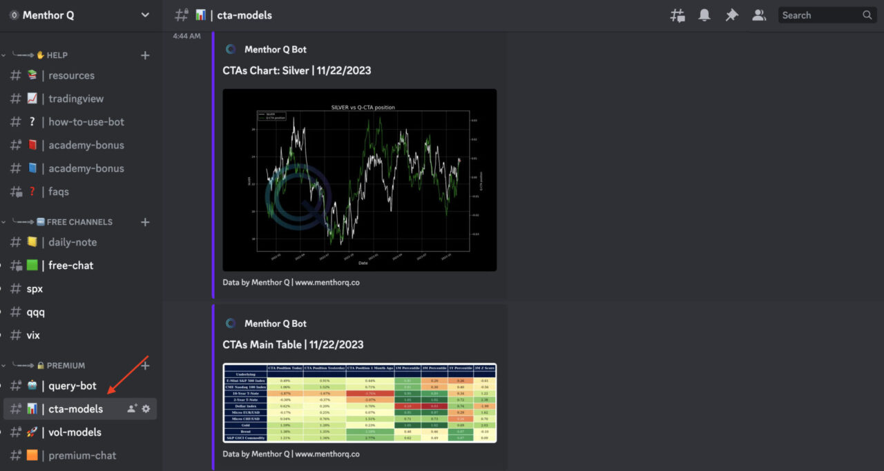
The CTAs Table and Charts will be delivered by our Premium Discord Membership via our Discord Bots.

Join our Discord and try it Free for 7 Days.
